
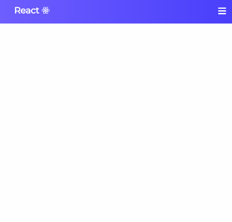
미리보기

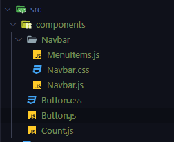
Navigation 구조
1.MenuItems.js
Navigation에 들어갈 list의 data (title, url, className *nav-links-mobile은 mobile 화면에서만 보일것)
export const MenuItems = [
    {
        title: 'Home',
        url: '#',
        cName: 'nav-links'
    },
    {
        title: 'Services',
        url: '#',
        cName: 'nav-links'
    },
    {
        title: 'Products',
        url: '#',
        cName: 'nav-links'
    },
    {
        title: 'Contact Us',
        url: '#',
        cName: 'nav-links'
    },
    {
        title: 'Sign up',
        url: '#',
        cName: 'nav-links-mobile'
    }
]
2. Button.js / Button.css
Button Component (Navigation에서는 Desktop에서 Sign-Up Button 사용)
import React from 'react';
import './Button.css'

const STYLES = [
    'btn--primary',
    'btn--outline'
]

const SIZES = [
    'btn--medium',
    'btn--large'
]

const Button = ({
    children,
    type,
    onClick,
    buttonStyle,
    buttonSize
}) => {

    const chkBtnStyle = STYLES.includes(buttonStyle) ? buttonStyle : STYLES[0]
    const chkBtnSize = SIZES.includes(buttonSize) ? buttonSize : SIZES[0]

    return (
        <button className={`btn ${chkBtnStyle} ${chkBtnSize}`} onClick={onClick} type={type}>
            {children}
        </button>
    )

}
export default Button
:root{
--primary: #3acbf7;
}
.btn {
padding: 8px 20px;
border-radius: 4px;
outline: none;
border: none;
cursor: pointer;
}
.btn:hover{
transition: all .3s ease-out;
background: #fff;
color: #6568F4;
transition: 250ms;
}
.btn--primary {
background-color: var(--primary);
}
.btn--outline{
background-color: transparent;
color: #fff;
border: 1px solid var(--primary);
transition: all .3s ease-out;
}
.btn--medium{
font-size: 18px;
color: #fff;
}
.btn--large{
padding: 12px 26px;
font-size: 20px;
color: #fff;
}3. Navbar.js / Navbar.css
- clicked가 false 일 땐 toggle == bars && menu className = .nav-menu
- clicked가 true 일 땐 toggle == times && menu className = .nav-menu.active
- MenuItems에서 가져온 변수는 map()함수를 이용해서 list return
import React, {useState} from 'react';
import './Navbar.css';
import { MenuItems } from "./MenuItems";
import Button from '../Button'

function Navbar () {

    const [clicked, setClicked] = useState(false);
    //false = bars, true = times
    const handleClick = () => {
        setClicked(!clicked);
    }

    return (
            <nav className="Navbar">
                <h1 className="navbar-logo">React<i className="fab fa-react"></i></h1>
                <div className="menu-icon" onClick={handleClick}>
                    <i className={clicked ? 'fas fa-times' : 'fas fa-bars'}></i>
                </div>
                <ul className={clicked ? 'nav-menu active' : 'nav-menu'}>
                    {MenuItems.map((item, index)=>{
                        return (
                                <li key={index}>
                                    <a className={item.cName} hre={item.url}>
                                        {item.title}
                                    </a>
                                </li>
                        )
                    })}
                </ul>
                <Button>Sign Up</Button>
            </nav>
        )
}
export default Navbar
.Navbar{
background: linear-gradient(90deg, rgb(110, 94, 254) 0%, rgba(73, 63, 252, 1) 100%);
height: 80px;
display: flex;
justify-content: center;
align-items: center;
font-size: 1.2rem;
}
.navbar-logo{
color: #fff;
justify-self: start;
margin-left: 20px;
cursor: pointer;
}
.fa-react{
margin-left: .5rem;
font-size: 1.6rem;
}
.nav-menu{
display: flex;
list-style: none;
text-align: center;
width: 70vw;
justify-content: flex-end;
margin-right: 2rem;
}
.nav-links{
color: white;
text-decoration: none;
padding: .5rem 1rem;
}
.nav-links:hover{
background-color: #6d76f7;
border-radius: 4px;
transition: all .2s ease-out;
}
.fa-bars{
color: #fff;
}
.nav-links-mobile{
display: none;
}
.menu-icon{
display: none;
}
@media screen and (max-width: 960px) {
.Navbar{
position: relative;
}
.nav-menu{
flex-direction: column;
width: 100%;
height: 500px;
position: absolute;
top: 80px;
left:-100%;
transition: all .5s ease;
}
.nav-menu.active{
background: #6668f4;
left: 0;
transition: all .5s ease;
z-index: 1;
}
.nav-links{
text-align: center;
padding: 2rem;
width: 100%;
display: table;
}
.nav-links:hover{
background-color: #7577fa;
border-radius: 0;
}
.navbar-logo{
position: absolute;
top: 0;
left: 0;
transform: translate(25%, 50%);
}
.menu-icon{
display: block;
position: absolute;
top: 0;
right: 0;
transform: translate(-100%, 60%);
font-size: 1.8rem;
cursor: pointer;
}
.fa-times{
color: #fff;
font-size: 2rem;
}
.nav-links-mobile{
display: block;
text-align: center;
padding: 1.5rem;
margin: 2rem auto;
border-radius: 4px;
width: 80%;
background: #fad934;
text-decoration: none;
color: #fff;
font-size: 1.5rem;
}
.nav-links-mobile:hover{
background: #fff;
color: #6568f4;
transition: 250ms;
}
Button {
display: none;
}
}